Digital Outcomes values
We highlight the human element that attentively dedicates itself to solving the challenges (that the brand proposes to face and solve), in detriment of the purely technological or digital issue. What really matters is the competent and dedicated individual component and not so much the tools or means used – these can vary from case to case and are evolving every day.
Digital Outcomes branding
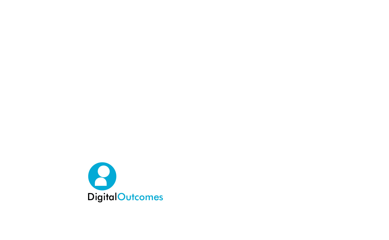
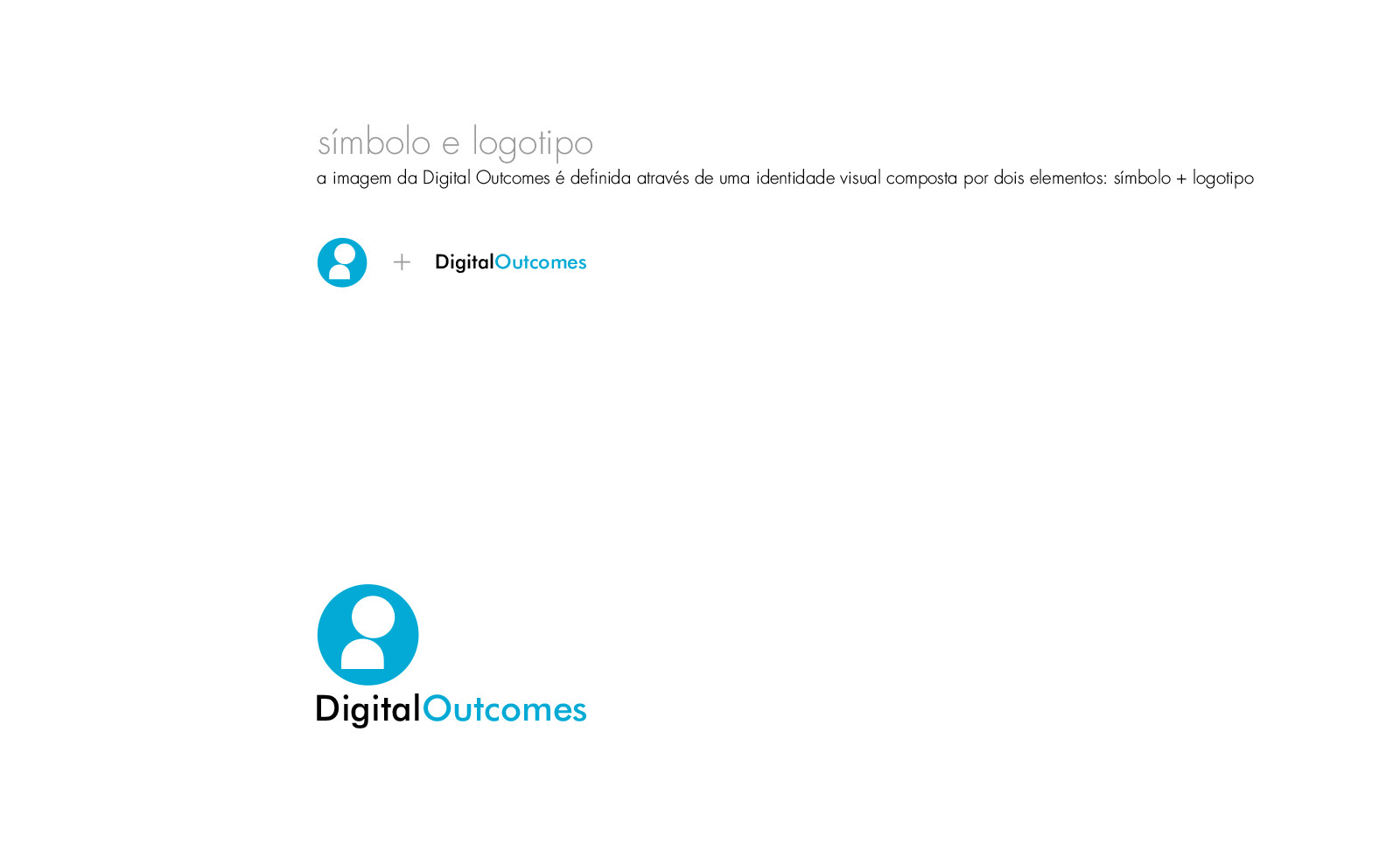
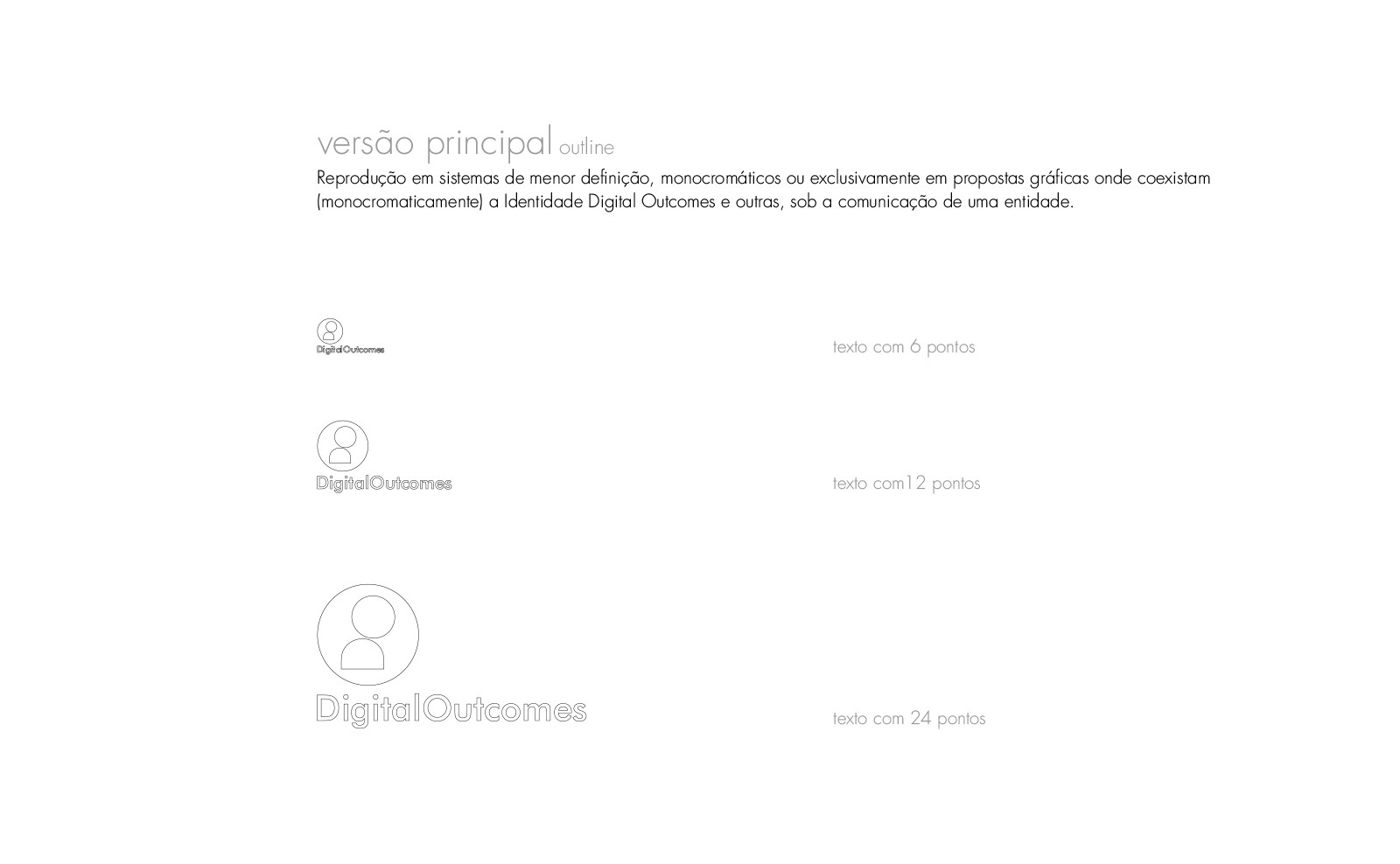
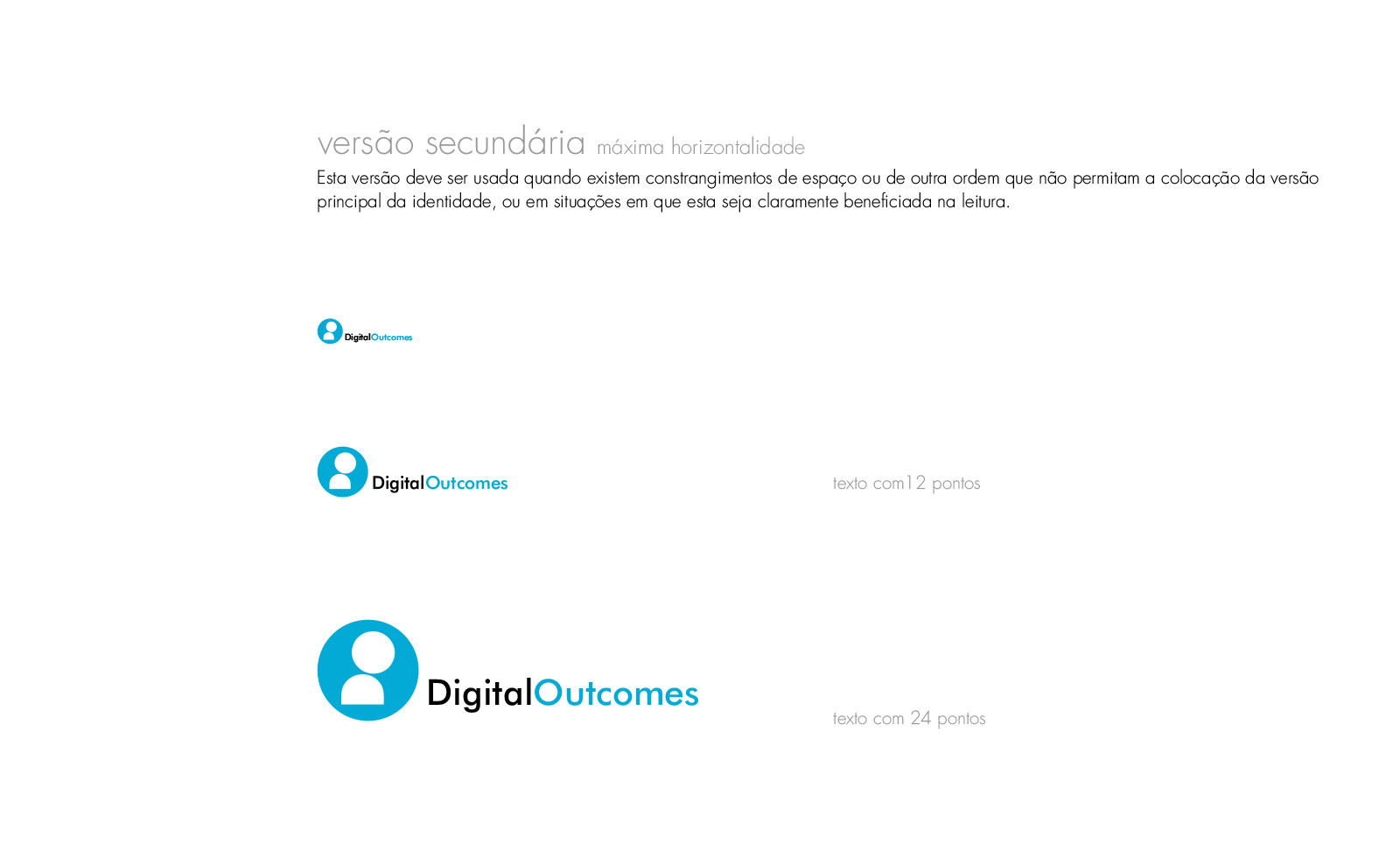
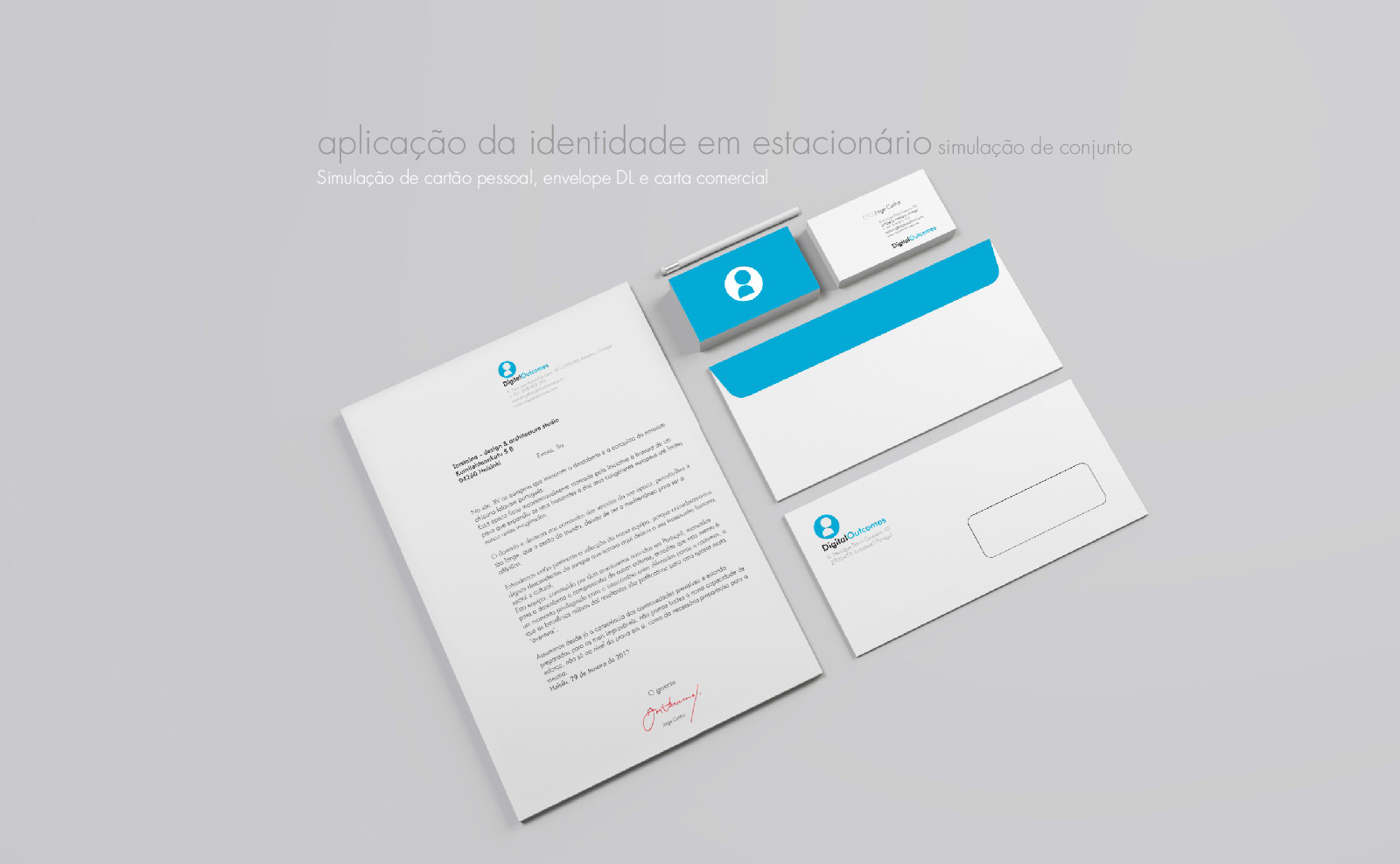
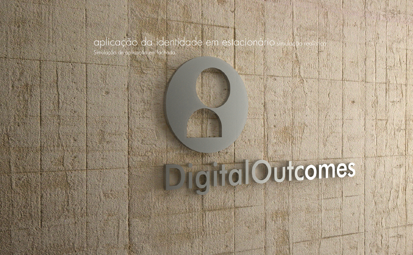
The concept presented aims at a contemporary approach without prejudice to a timeless posture – in this way it was chosen a set of icon + typography where both can be used together or separately, always allowing the desired identification or referencing.
job briefing
Digital Outcomes brand / corporate identity concept and development.
project details
scope
Commission
client
Digital Outcomes
collaboration with
Emanuel Cerdeira
date
2017
Digital Outcomes concept
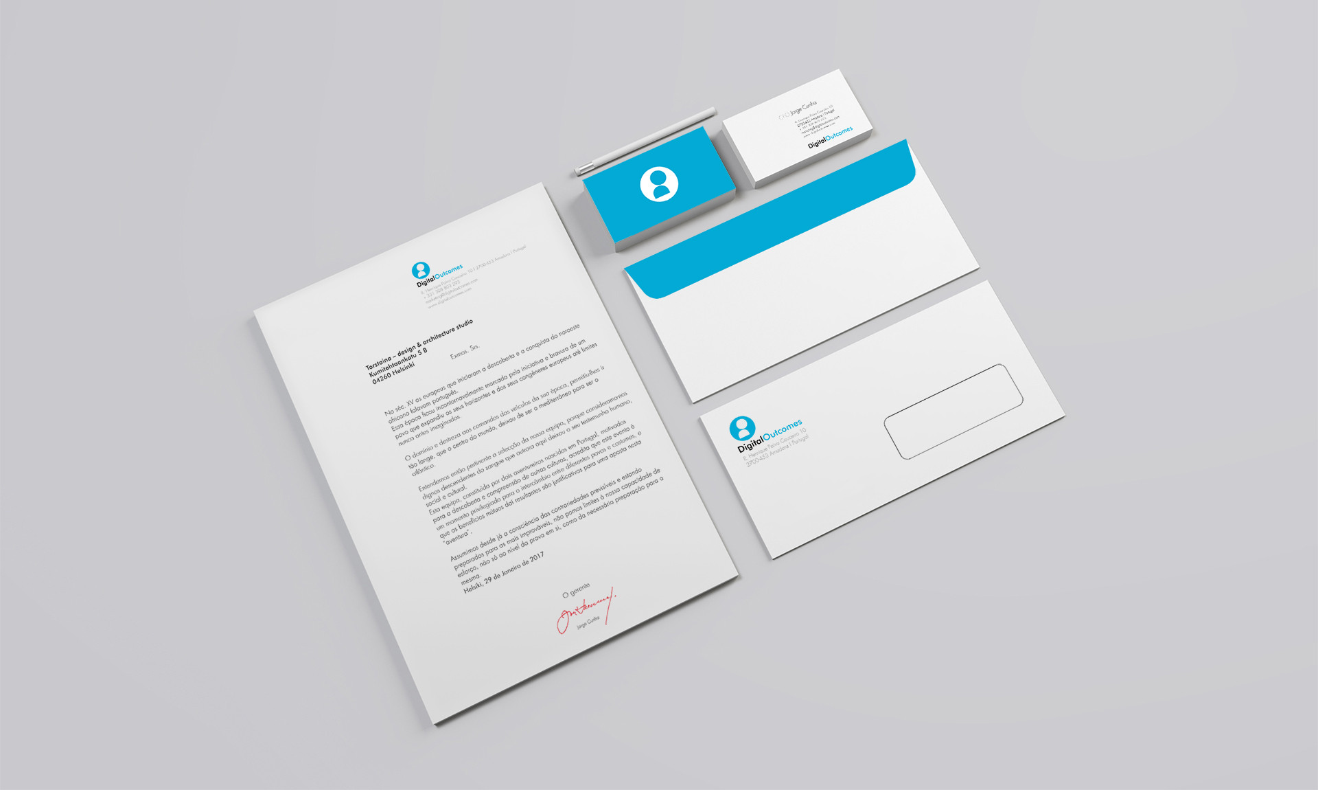
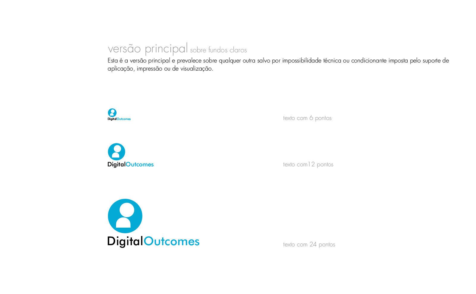
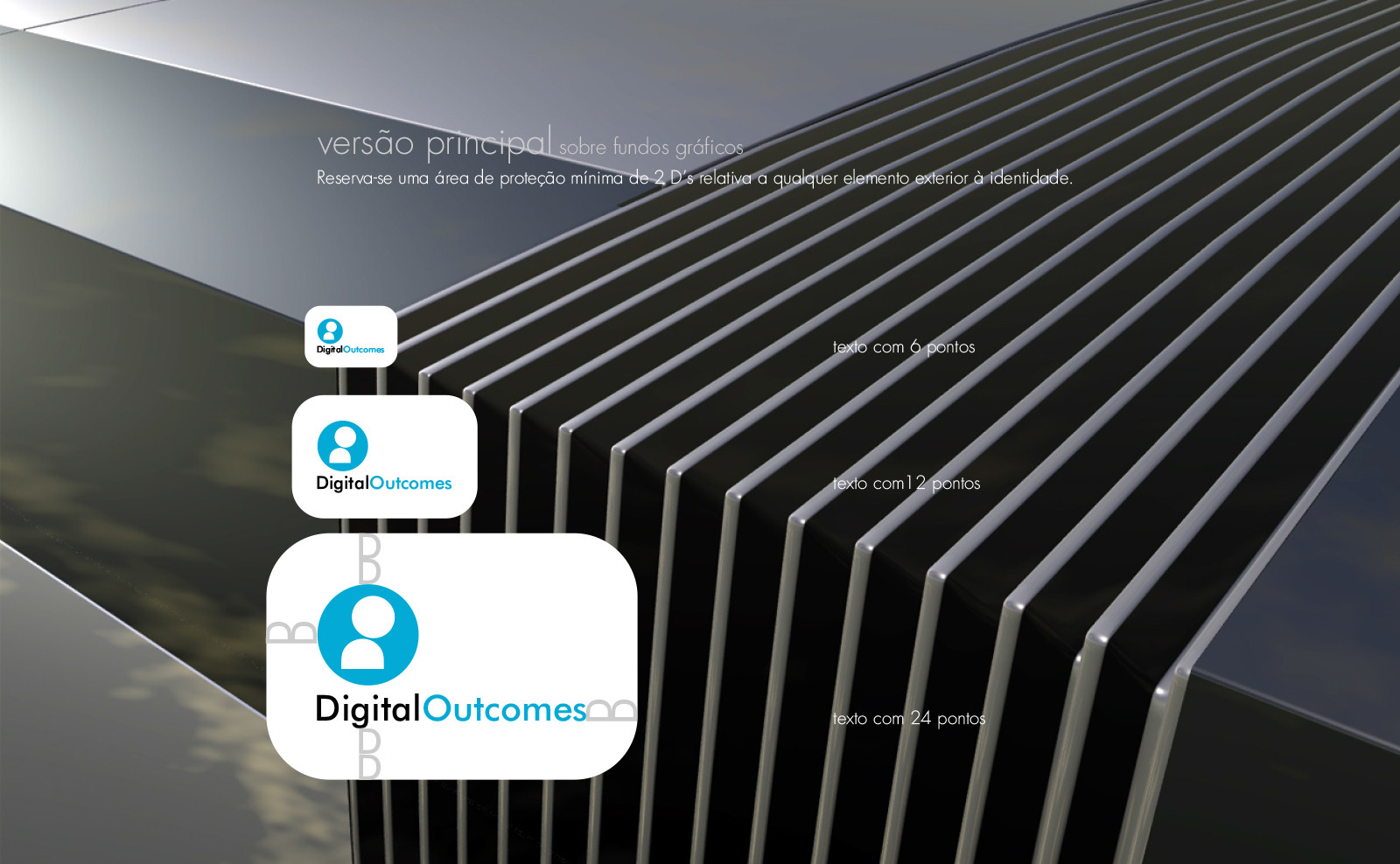
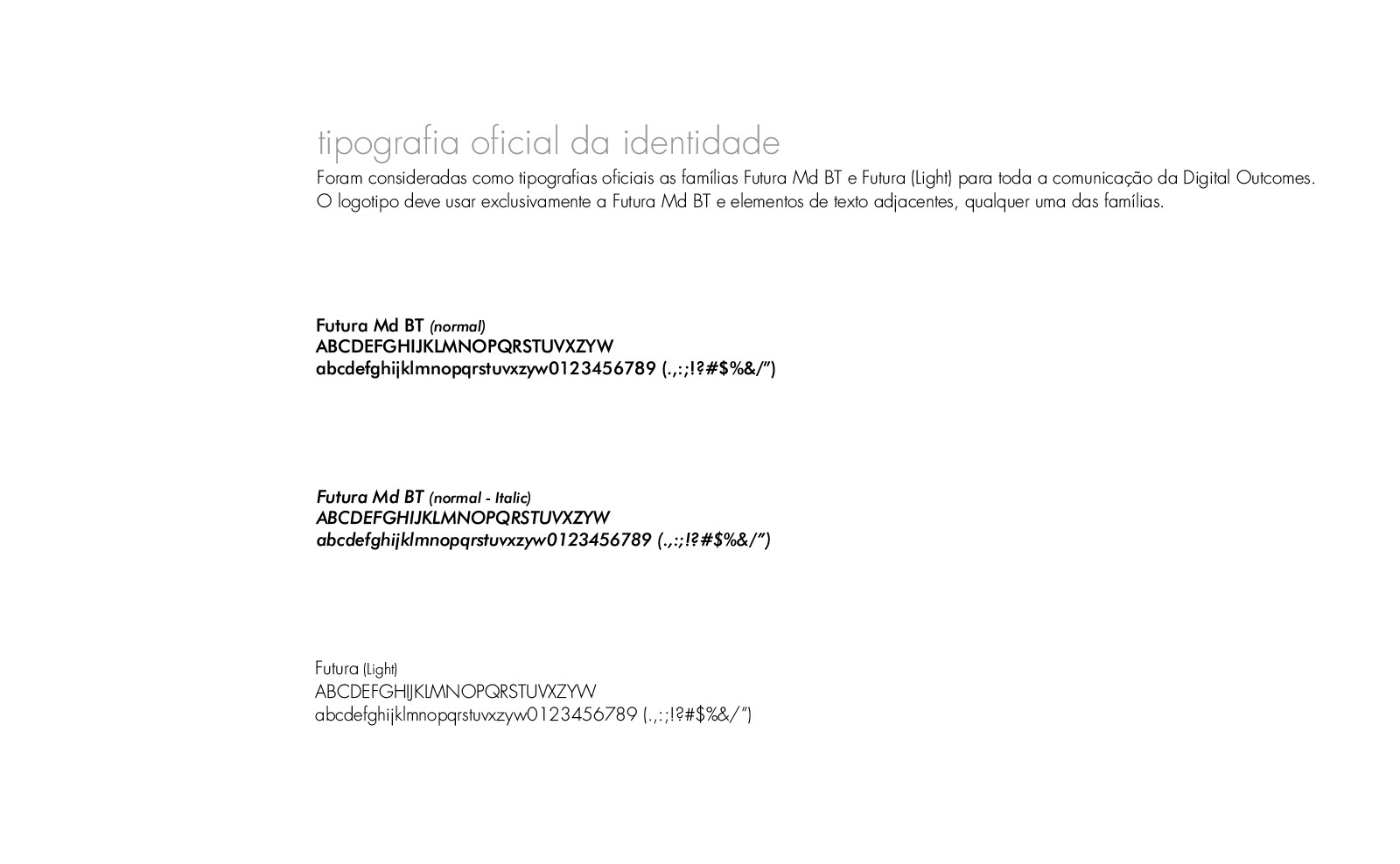
Both elements (icon + typography) make it easy to use on material supports (stationary) or on digital platforms – the acronym is properly sized to work satisfactorily, for example on the social networks “instagram” and “pinterest”, while the text is based on a font TTF open, can be easily typed on digital documents.
Digital Outcomes solution
The logo is characterized by an elementary and balanced complexity, aiming to promote an easy and quick memorization of the brand through three different and complementary perspectives:
1. perceptual function – few and little complicated graphic elements
2 . emotional function – the relationship with the pictographic humanoid element (attentive and dedicated)
3 . cognitive function – the association between the pictographic humanoid element and the lettering is subliminal and induced by it being composed of the initial letters of the brand «D» and «O», differently rotated. It will always check itself, more or less consciously.


